


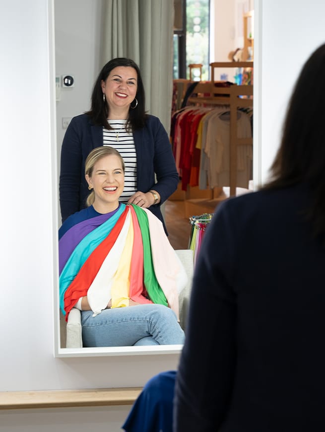
How can colours work for multiple seasonal palettes?

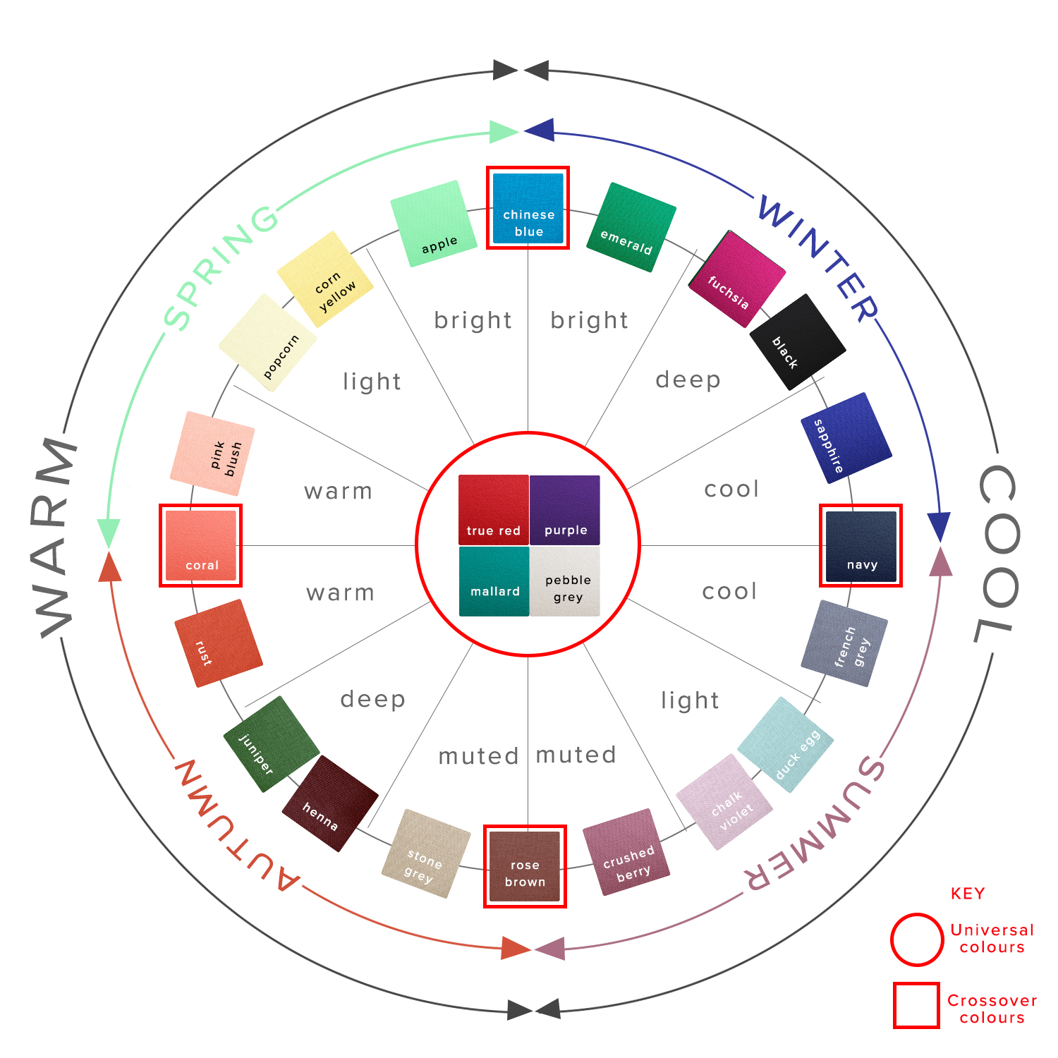
You may have noticed that when we code each of our colours, plenty of colours end up belonging to more than one seasonal palette, denoted by 'sp' for Spring, 'su' for Summer, 'au' for Autumn and 'wi' for Winter in the product listings. If you've had a personal colour analysis, you may well have been told that every single colour belongs to one of the four seasons - it is either cool or warm, and either muted or bright. A colour belongs in your palette, or it doesn't. You may also have had your colours analysed ‘tonally’. Click here for our tonal palettes.
And on a totally technical, science-of-colour-and-light-reflection level, you'd be right. A colour either has more yellow (warmth) or blue (coolness), or it hasn't. However, there are a few factors at play which determine whether a colour can be classified as belonging to more than one seasonal palette.
The specific colour
The first factor to consider is the 'true' colour we are looking at, in terms of how warm or cool it is, how bright or muted it is, and how light or dark it is, and assess which season it belongs to according to that. Colours are divided up between the four seasons in the following ways:
Spring - warm, bright/clear, light to medium, high contrast
Summer - cool, soft/muted, light to medium-dark, tonal/low contrast
Autumn - warm, soft/muted, medium-light through to dark, tonal/low contrast
Winter - cool, bright/clear, very light through to very dark (the only season which contains true white and true black), very high contrast
As you can see, each season shares one or two characteristics with each of the other seasons, which means that a colour that shares those characteristics will fall closer to the dividing line between those seasons. A colour which is warm, medium in depth and falls somewhere between muted and bright, could be a fraction either side of the line between Spring and Autumn.
What affects whether we decide to term it as being firmly on one side of the line, or belonging to both is not a scientific analysis of the chemical make up of the colours and which light waves they reflect but simply our eyes. At Kettlewell it's well trained and experienced eyes, under expensive and often revealing full spectrum lighting. But eyes, nonetheless.
The naked eye
When considering colour out in the real world, we need to accept that we aren't looking at it on a molecular level, assessing the precise brightness and warmth with a scientific measure. We are looking at it with a naked eye.
A person with good colour vision is perfectly capable of seeing the difference between - and the different effects on our skin of - a very warm and a very cool colour, or a very bright and a very muted colour. However, colour is a spectrum, and as we come closer to the boundary line between warm and cool, or muted and bright, it becomes ever trickier for the naked eye to distinguish the difference in the precise colour, and on the fractionally different effect it has on our own skintone. Go one shade or less either side of that dividing line and you've got something which is, on a practical level, impossible to tell apart from the the colour the other side of that dividing line.
Individual colour perception varies (search online for a colour sensitivity test if you want to see how good yours is!), but even the most perceptive among us have a limit to the differences we can see between very similar colours.
What all that means, in real-life, is that the closer a colour falls to the dividing line between warm and cool, or bright and muted, or light and dark, the less easy it is to put it in one absolute season. So it makes sense to give it to two, three or even four seasons (depending on how close to how many dividing lines it falls).
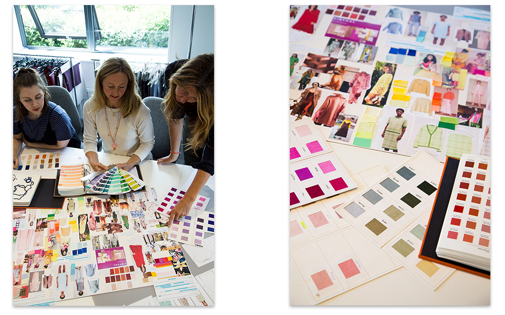
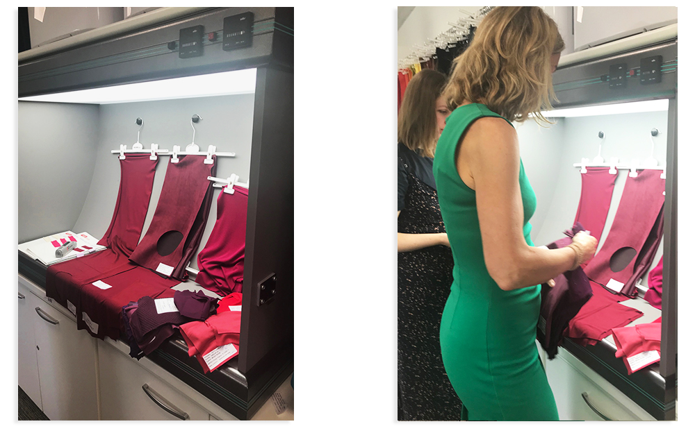
We are introducing Rumba Red next season and it is a good example of the careful process that any new colour goes through before being coded.
This gorgeous rich, deep red was inspected in our full spectrum light box and tried against swatches of existing colours and a variety of skin tones in the office. When we considered it tonally, Rumba Red sits at the ‘Deep’ end of three seasons; Summer, Autumn and Winter but is not particularly ‘Warm’ or ‘Cool’. As a ‘Deep’ shade it best suits Burnished Winters, Blue Autumns and Deep Summers (for more information on seasonal sub-types read this blog post).
We use colour combinations to 'pull' it further into the relevant season as required. Which leads us neatly on to the third factor when assessing whether a colour can be given to more than one season.
Compare and contrast
It's not simply the reflection of light which affects how we view whether a colour sits within our palette or not - it's also how it appears in relation to the colours next to it. So if we wear a colour in a high contrast way, it looks far brighter than if it is paired with soft muted shades. Likewise, a neutral colour worn with warmer shades looks more like it belongs to the warmer palette, and worn with cooler shades looks like it belongs with the cooler palette.
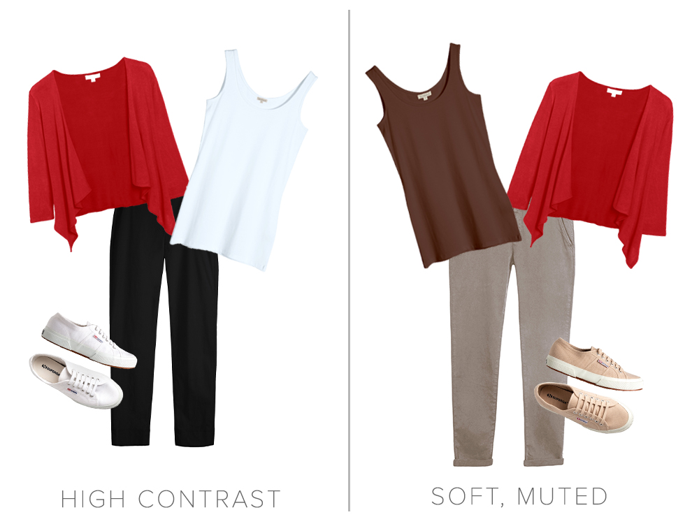
True Red Short Cascade Wrap worn high contrast with White Long Vest and Black Marie Trousers and All White Superga Canvas Trainers or worn with soft, muted Cocoa Long Vest Top, Flint Reiko Chinos and Stone Superga Canvas Trainers.
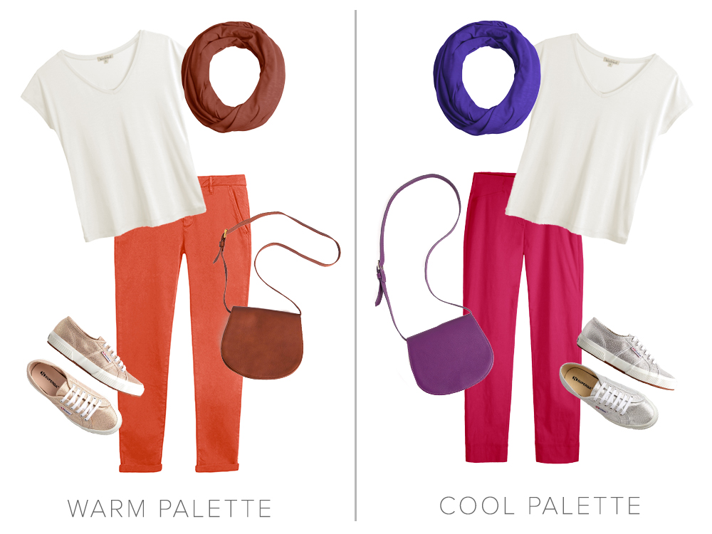
The neutral Nimbus Cara V Neck worn with Copper Rose Florence Infinity Scarf, Burnt Coral Reiko Chinos, Rose Gold Superga Metallic Trainers and a Chocolate Leather Shoulder Bag sits in the warm palette but worn with Lobelia Florence Infinity Scarf, Magenta Rosa 7/8 Trousers and Silver Superga Metallic Trainers and a Purple Leather Shoulder Bag sits in the cool palette.
It is through putting together our outfits, as well as the examination we go through when choosing the individual colours, that we can create a look which is harmonious and flattering for our own unique colouring.
Please remember that Kettlewell’s colour coding is a guide and that your colour consultant can advise you on a more individual basis. We also recommend visiting your consultant for a ‘Colour Re-rate’ every 5-10 years as your star rating within your palette is likely to change as you age. This will also give you some fresh new ideas for updating your wardrobe.