

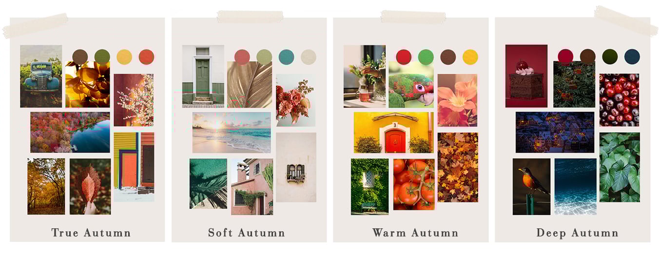
The Different Seasonal Sub-Types of Autumns


The Autumn Seasonal Colour Palette Explained
The Autumn palette is warm, rich, earthy and vibrant. It stretches from leaf greens to old gold, and from every shade of peacock to soft clay pinks. Knowing your seasonal sub-type means knowing which of these colours from your wider palette will work best for you, and give you guidance on the best way for you to combine colours to feel your most authentic, confident self.
Let’s explore the sub-types within the Autumn palette, and discover how knowing your sub-type can open up even more amazing colours for your wardrobe.
Do remember that your seasonal type is a guide. It doesn’t mean you can’t ever go near colours from other areas of the Autumn palette, just that the particular area of your sub-type is the very best part for your own skin tone and contrast level. Remember that all of the colours within your wider seasonal palette will also work for you, and will harmonise with your very best sub-type colours.
The True Autumn Seasonal Colour Palette Explained
This is the classic Autumn palette. The True Autumn has an even mix of Autumn's warm, soft and deep characteristics.
True Autumns often (although not always!) have a ‘classic’ Autumn look, full of warmth and depth; they can have warm brown or red tones in their natural hair colour, hazel or green tint to their eyes, and those with white skin often have a natural flush to their cheeks. True Autumn skin tone can be much deeper, although rarely darker than average for the person's ethnicity, and there is always a warm golden glow to non-white skin tones when flattered by their best colours.
Because True Autumns sit right in the middle of the Autumn palette - there there is no ‘leaning’ towards any of the other three seasons, by being deeper, softer, warmer or cooler - the best colours for True Autumns are, simply the colours of Autumn! Cheating on your palette by shopping from colours in another palette is never going to work as well for you as one of the other types of Autumns, who can push into their neighbouring season.
The flip side is that you look the best in the widest range of Autumn colours, as you really do sit bang in the middle of this palette. This means that it isn’t often helpful to add a tonal direction to the shopping filter on the Shop by Colour page, as adding in colours from other seasons rarely helps you - simply choose from the full Autumn palette and you’ll never go far wrong!
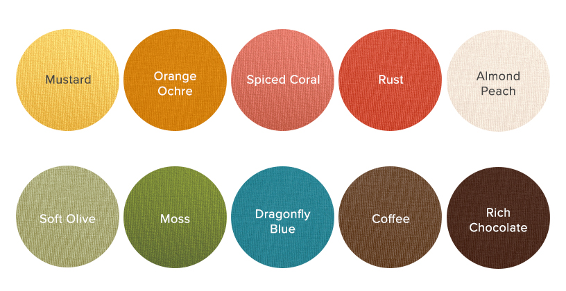
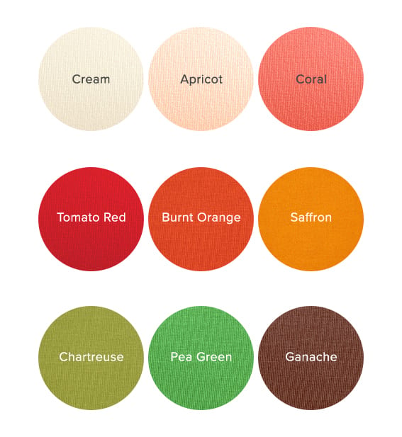
You still have your own very best core of colours though. They are, unsurprisingly, the most definitively Autumn colours. Think of leaves turning golden, rust and brown in September sunshine, of grassy tones growing deeper and richer, of moss and lichen putting on a display as leaves fall, of kingfishers dancing over lakes. They heavily feature warm mustard yellows and mossy greens, alongside mid tone browns and rust reds, and they all share that equal balance of warmth, depth and softness that you also hold.
When it comes to colour combining, the classic Autumn technique of layering up similar colours is usually your best look - browns and rusts, or greens and yellows, for instance. Brighter shades are usually best worn as an accent in a tonal look.
The Warm Autumn Seasonal Colour Palette Explained
Also known as Vibrant Autumn (which can be used as something of a catch all phrase for Autumns who need more saturation, so it’s possible to be a Vibrant Autumn and also sit in the Deep end of the Autumn palette), the most noticeable characteristic of Warm Autumns is the warmth in their skin, hair and eye colour, although they still retain a degree of Autumn’s softness and depth of colouring too.
Warm Autumns often (again, not always) have a real warmth to their hair, with red or auburn tones in every hair colour from darkest brown to blonde. Eye colours is often green, blue or light hazel (very often somewhat light and bright for their ethnicity) and whatever their skin colour, they have a real golden warmth to their look when wearing the right colours.
Warm Autumn falls at the very warmest, most yellow toned end of the Autumn palette, and if you viewed all four seasonal palettes as one continuous spectrum of colour, the Warm Autumn colours would fall nearer to Spring (which shares the tonal characteristic of warmth with Autumn) than to Winter or Summer. Think about mixing Spring's brightness in with traditional autumn shades - yellows are a little more golden, rusts a little more orange or red, greens a little more leafy. Warm Autumn’s best colours are usually warm greens, yellows, orangey reds, very peachy (yellowed) pinks and every shade of golden brown from warm chocolate tones through to light tan.
While most Autumns suit tonal looks when combining colours, your tendency to sit towards the Spring end of the Autumn palette can mean that you prefer a little more contrast in your look, often by combining unexpected vibrant colours or through light and dark contrast. Be led by what feels best for your personal style here!
The dominant tonal direction for this seasonal sub-type is Warm, so you can visit Shop by Colour and filter for the Warm dominant tonal direction for more colours which you might love (if you want to read more about how tonal directions relate to seasons, this post is a great starting point).
The Soft Autumn Colour Palette Explained
The most dominant characteristic of Soft Autumn is a soft, tonal, low contrast look, more than the depth or warms of Autumn (which they also hold, but to a lesser degree).
Soft Autumns very often look like they might be Summers, with ashy toned hair and soft grey, blue or grey-hazel eyes. Whatever their skintone or eye colour, there is generally very little contrast between hair, skin and eye colour (a black and white photo would show no extremes in colouring, for instance).
Soft Autumn falls at the least warm, softest end of the Autumn palette, and if you viewed all four seasons as one continuous spectrum of colour, then Soft Autumn’s colours would fall nearer to Summer than Winter or Spring.
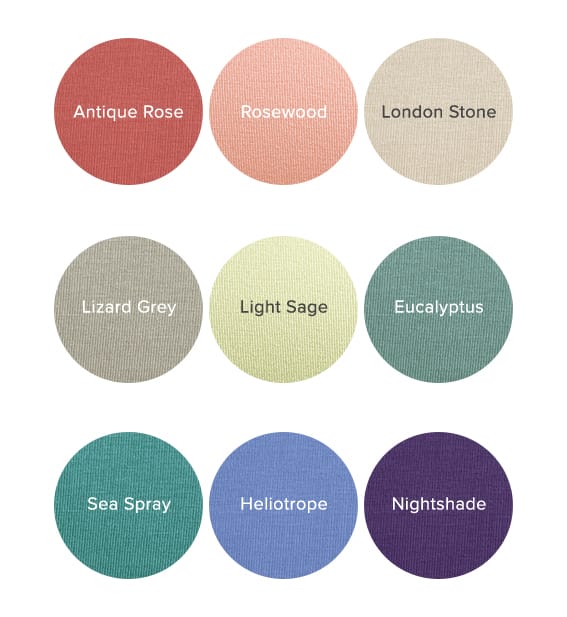
Soft Autumn’s colours are usually those which look like they might just belong to summer - clay or brown toned pinks, soft purples, greyed teals and warm taupes. Imagine sun baked earth and still pools of water before autumn's colder temperatures and rains have added saturation back into the scenery.
When it comes to colour combing, the classic Autumn technique of layering up similar colours is usually your best look - taupes and soft purples, or soft greens and teals, for instance. Brighter shades are usually best worn as a small accent in a tonal look.
The dominant tonal direction for this seasonal sub-type is Soft, so you can visit Shop by Colour and filter for the Soft dominant tonal direction for more colours which you might love (if you want to read more about how tonal directions relate to seasons, this post is a great starting point).
The Deep Autumn Seasonal Colour Palette Explained
Occasionally known as Blue Autumn, Dark Blue Autumn, and Dark Autumn, the most dominant characteristic of these Autumns is the depth of their look. They still retain Autumn’s warmth and softness, but depth is the most predominant trait.
Dark Autumns often look like Winters, with a wide range of skin tones and generally dark hair relative to their skintone, and eyes that have a degree of brightness to them, whether brown, hazel, blue or green.
Similarly to Soft Autumns, Deep Autumns also sit at the less warm end of their palette, but this time if you were to view all four seasons as a continuous spectrum of colour, instead of sitting towards the soft Summer palette, Deep Autumns sit towards the Winter palette. This means that all of Deep Autumn’s colours are beginning to acquire the saturation and depth of Winter’s colours.
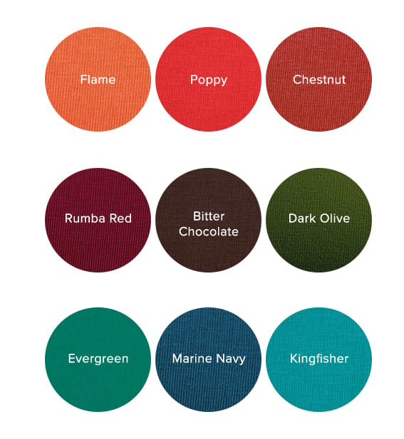
Deep Autumn’s colours are very often shades (colours with black added, which makes them deeper and more intense). Neutrals are marine navy and soft white rather than chocolate and beige, and bold shades of red, green and teal abound to add contrast.
Since colour combining is very often about reflecting our own features, sticking to a higher contrast look than most Autumns works well Rather than a soft, tonal look, Winter’s guideline of two neutrals and a colour pop can be more effective.
The dominant tonal direction for this seasonal sub-type is Deep, so you can visit Shop by Colour and filter for the Deep dominant tonal direction for more colours which you might love (if you want to read more about how tonal directions relate to seasons, this post is a great starting point).


About Kettlewell
Kettlewell is a British fashion brand dedicated to making it effortless for people to wear their best colours. Founded over 20 years ago near Chard, Somerset, it has grown from a small collection of seasonal T-shirts into the UK’s leading online colour retailer, offering over 300 carefully curated shades across a range of versatile styles. With a focus on confidence-boosting colour and timeless everyday fashion, Kettlewell helps people create wardrobes that bring them joy.

